

It was important for me to re-brand a company that I was intimately familiar with. Palmer’s is something that has been passed down in my family from member to member. Although the products are spectacular, I felt that the current branding felt somewhat disconnected from the audience that they cater to.
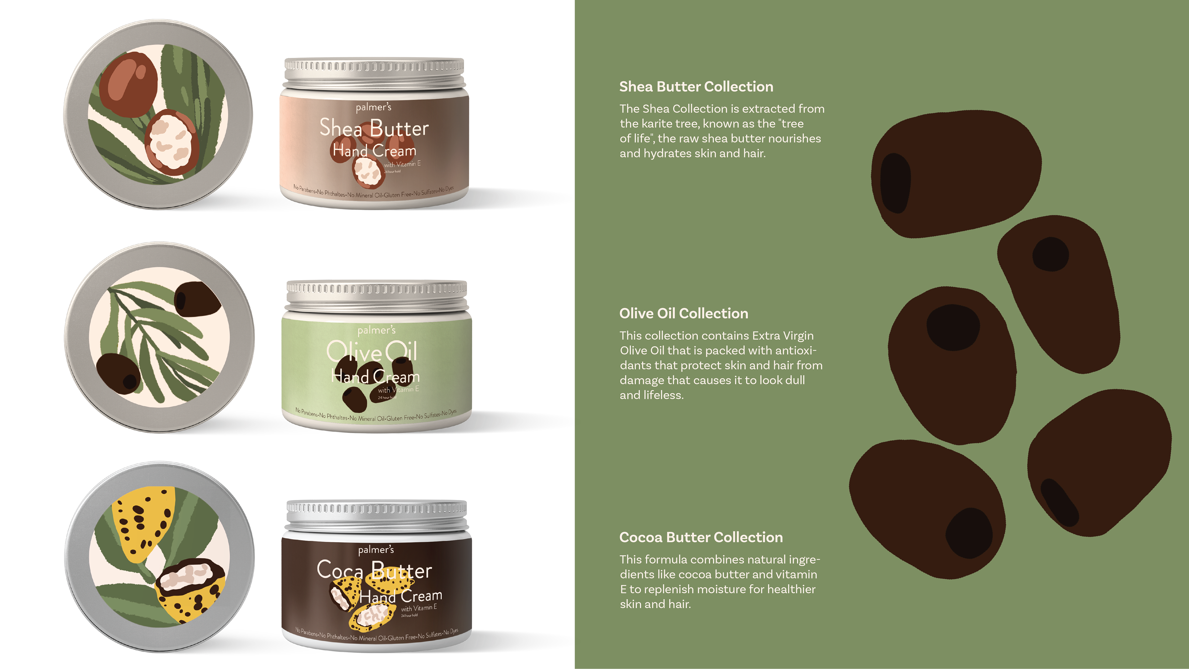

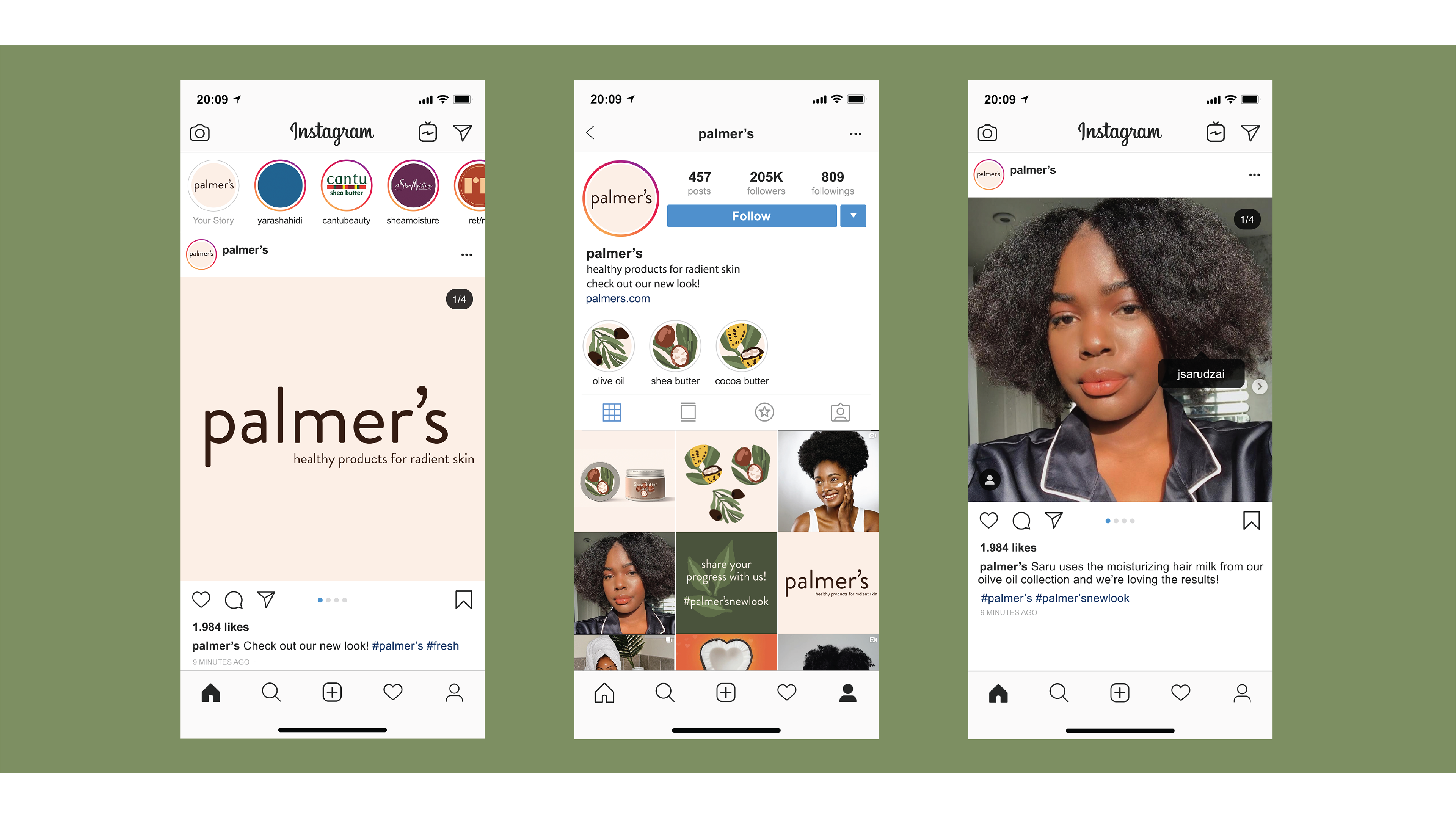
The ultimate goal of this redesign was finding a language that would resonate with the brand's audience, new and old. I felt that a cutout illustration style would be the perfect marriage between keeping a classic brand fresh and new while still being respectable.
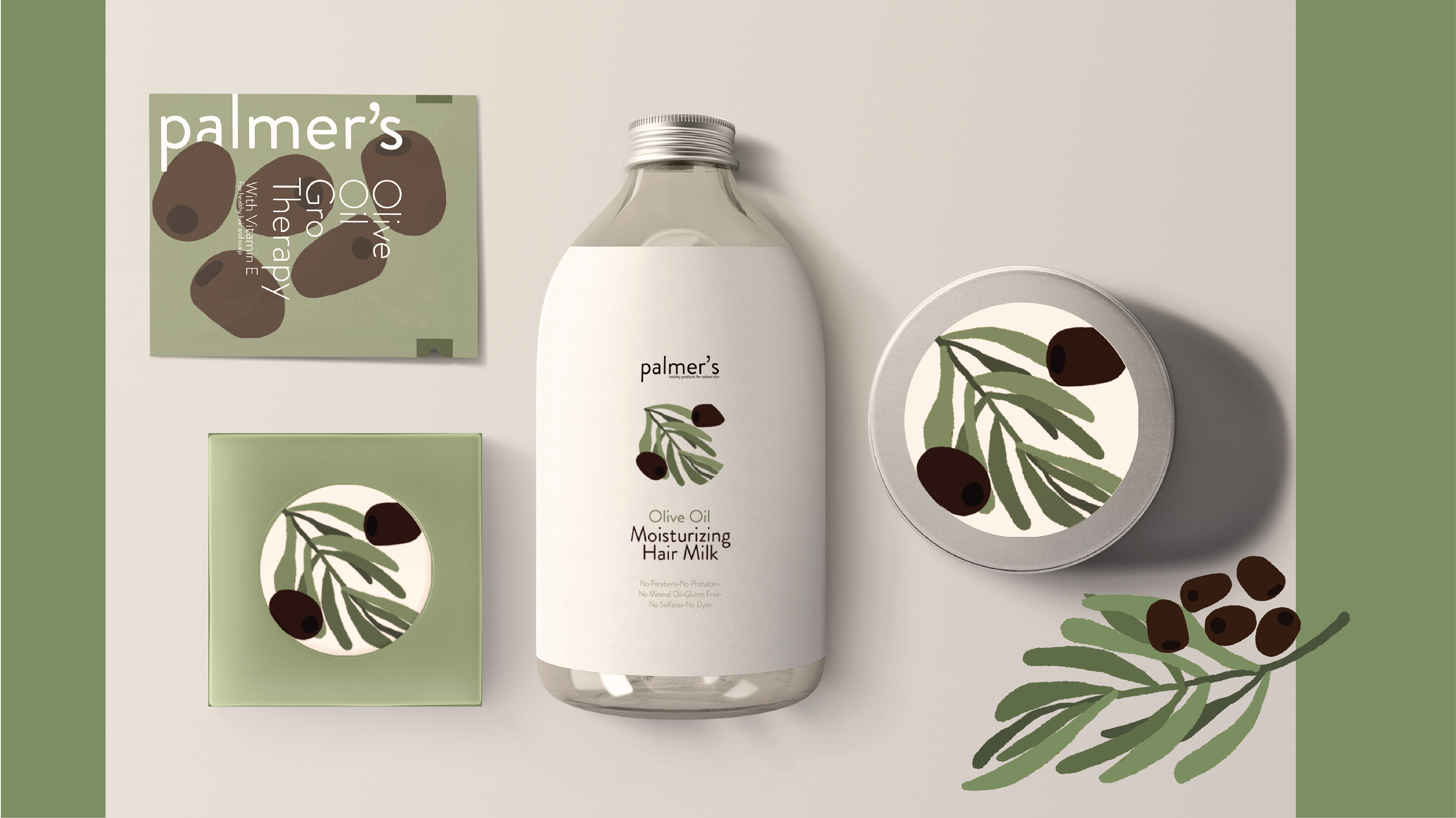
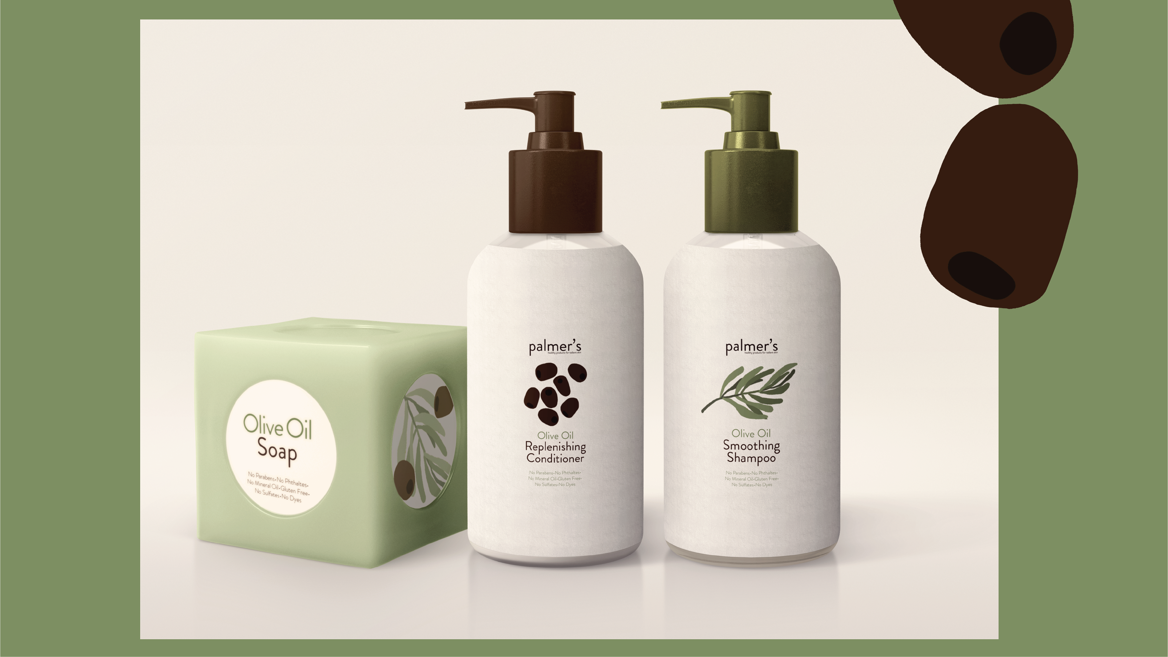
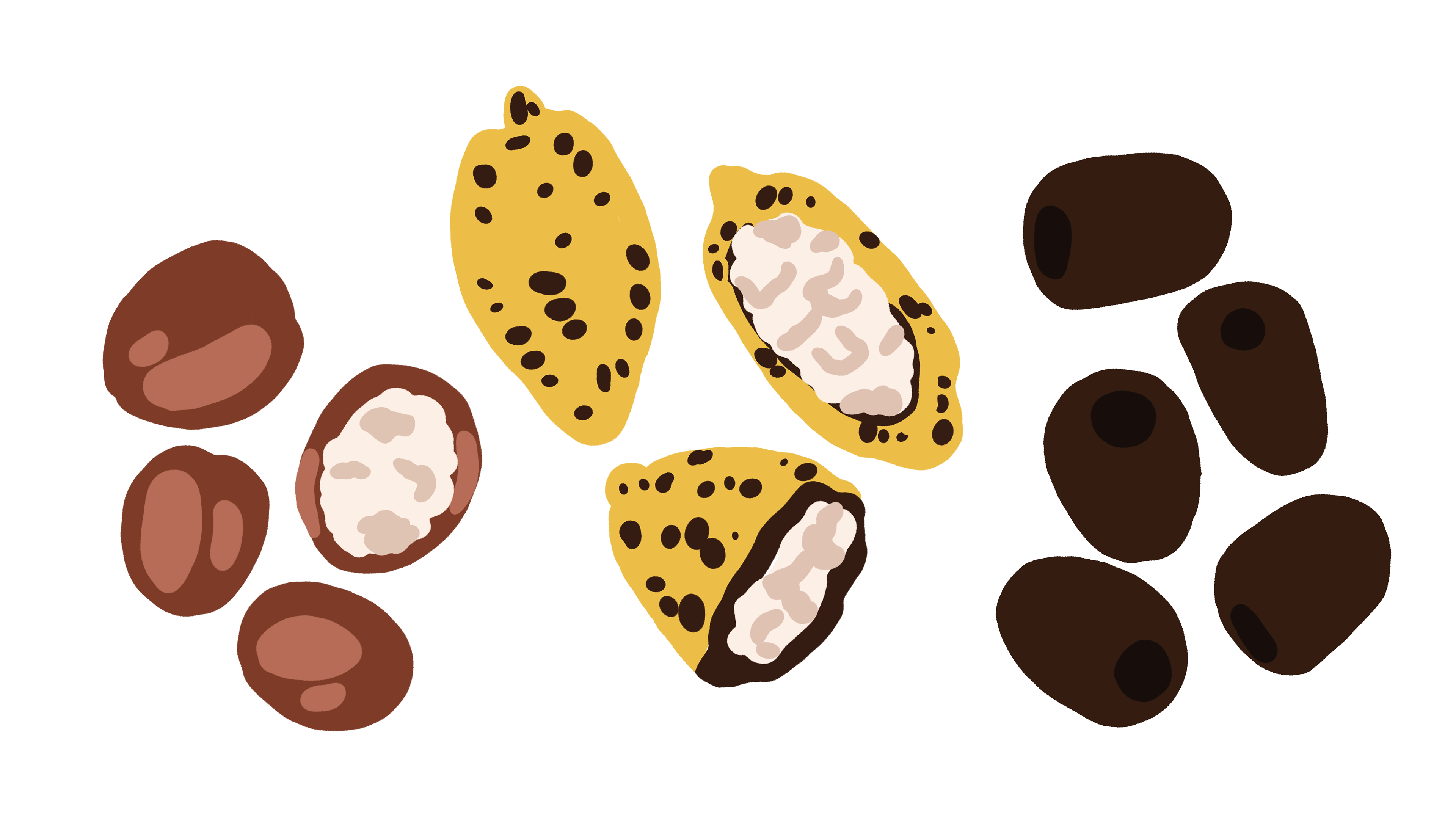
Each collection would have their own distinguishing illustration set and color palette for easy shopping and product identification.
Thank You for Viewing!