
HoneyPot is a feminine hygiene brand that is completely plant-based; the branding is the perfect mixture of sassy and quirky. I felt the juxtaposition of triple entendres and feminine grace, something that the company does so well, was a great inspiration for me in creating a new mark.
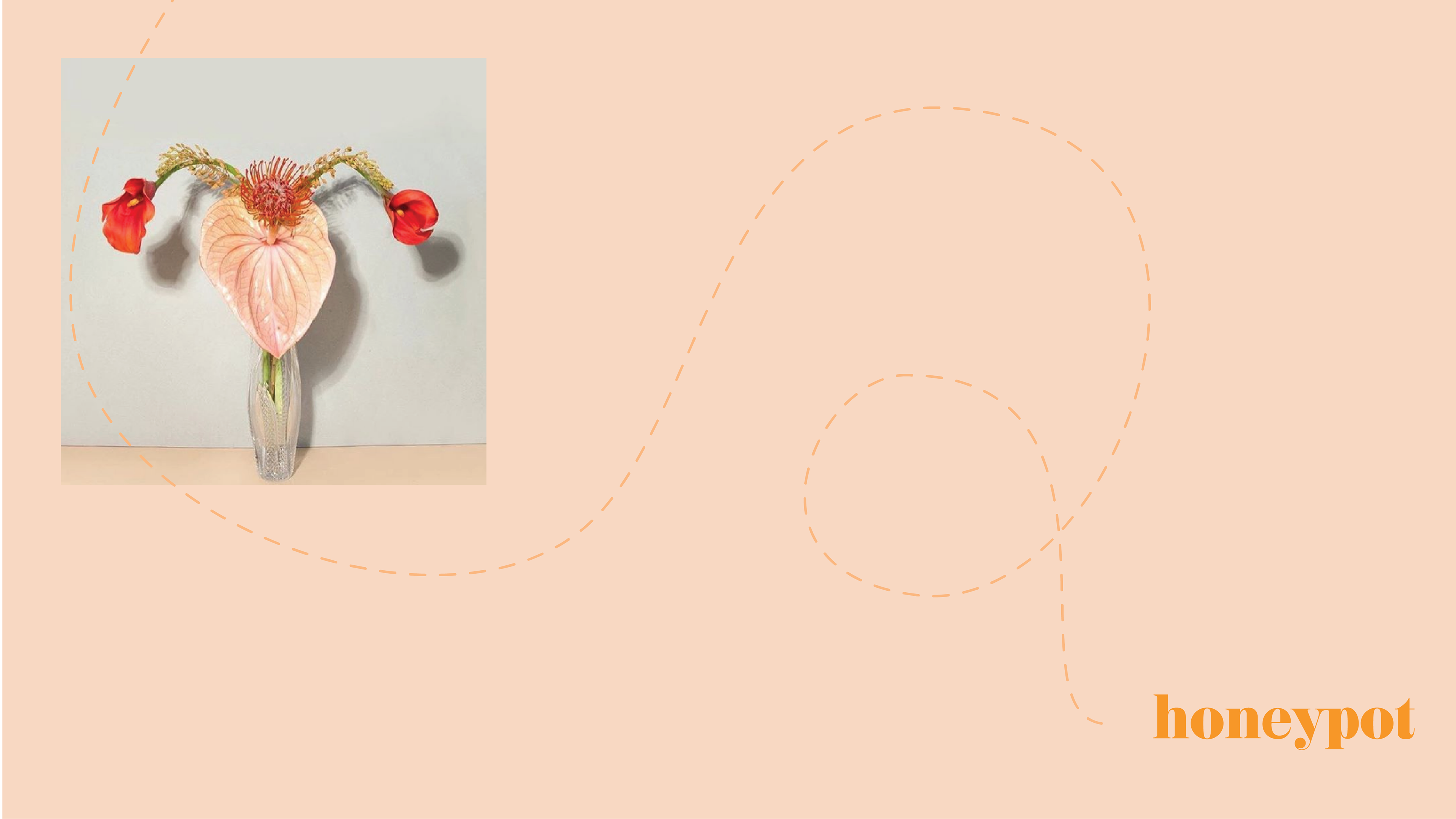
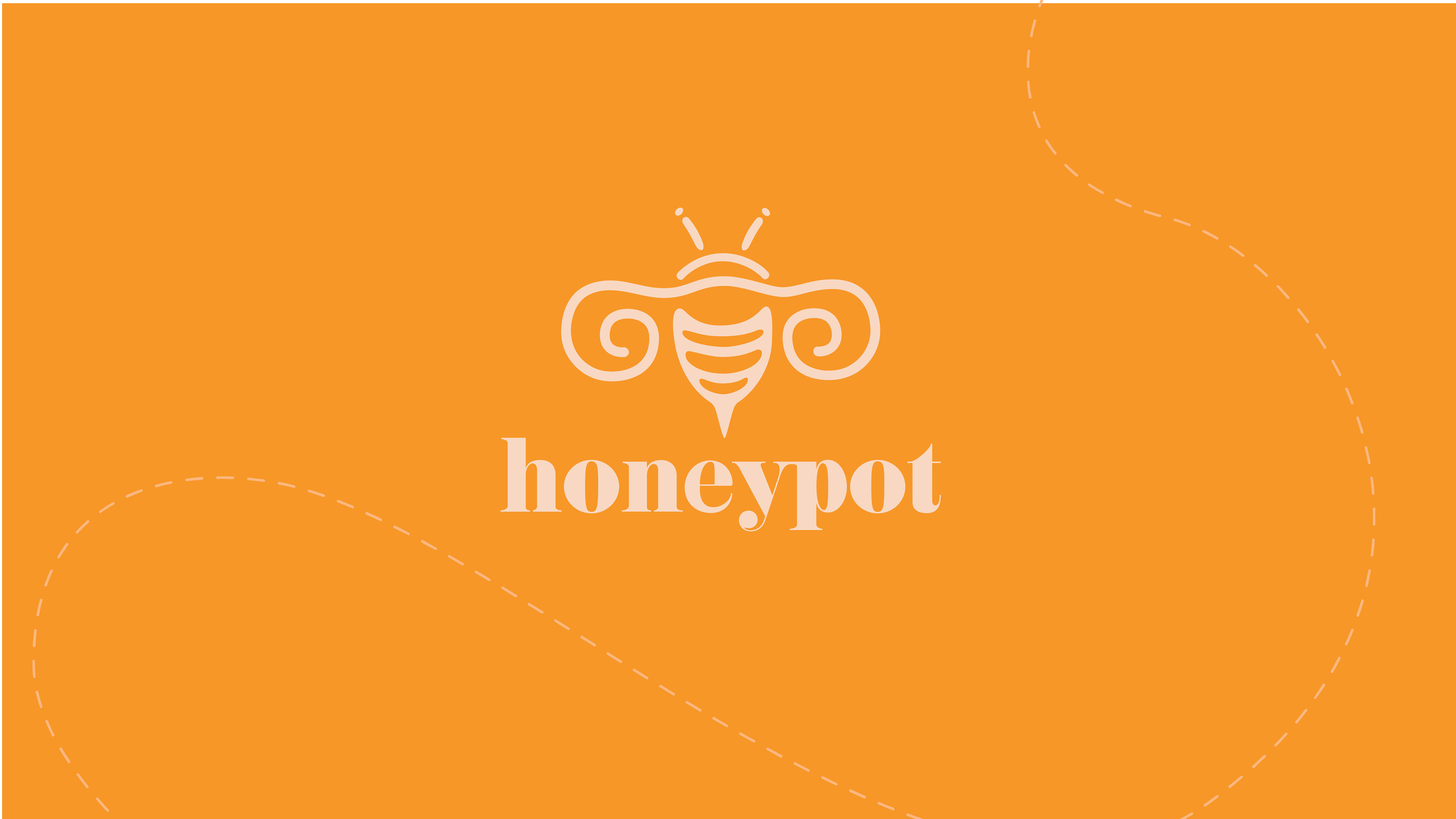
Keeping in theme with the brand's clever naming, I decided to display it in my version of the logo. Since HoneyPot itself is a euphemism, I felt that something matching would be appropriate. The bee is a combination of three elements: a bee, a uterus, and a diva cup.
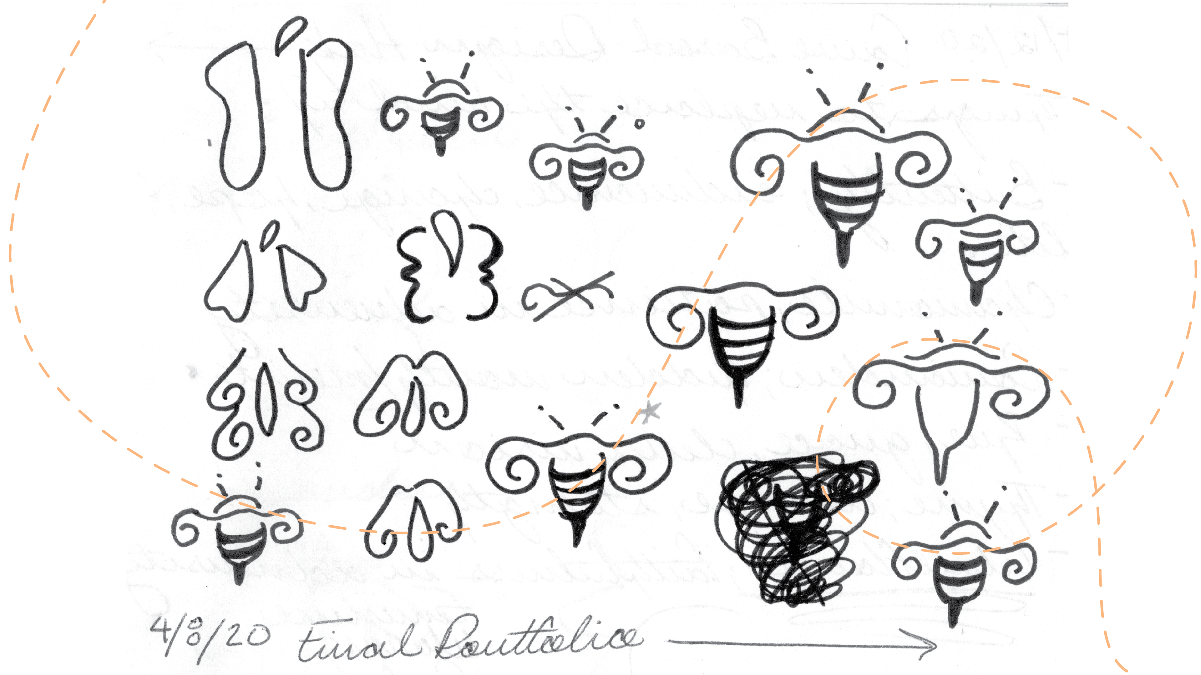

It was important to me that the logo would be able to fit into a nice pattern, so the brand could extend into more packing opportunities.

Thank You for Viewing!